CONNECTING THE DOTS IN HEALTHCARE
Enterprise, part of AAH Healthcare, approached us with a unique challenge. They weren't looking for a new logo or complete rebrand; instead, they needed a compelling story that would position them as more than just providers of over-the-counter product deliveries. The brief was clear: showcase Enterprise as the vital connector within the health network, demonstrating their extensive reach and commitment to the healthcare ecosystem.
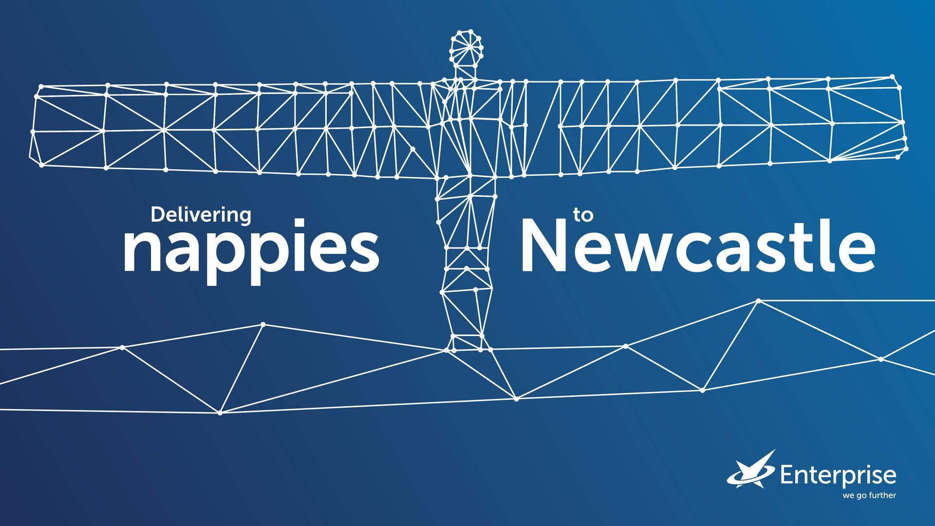
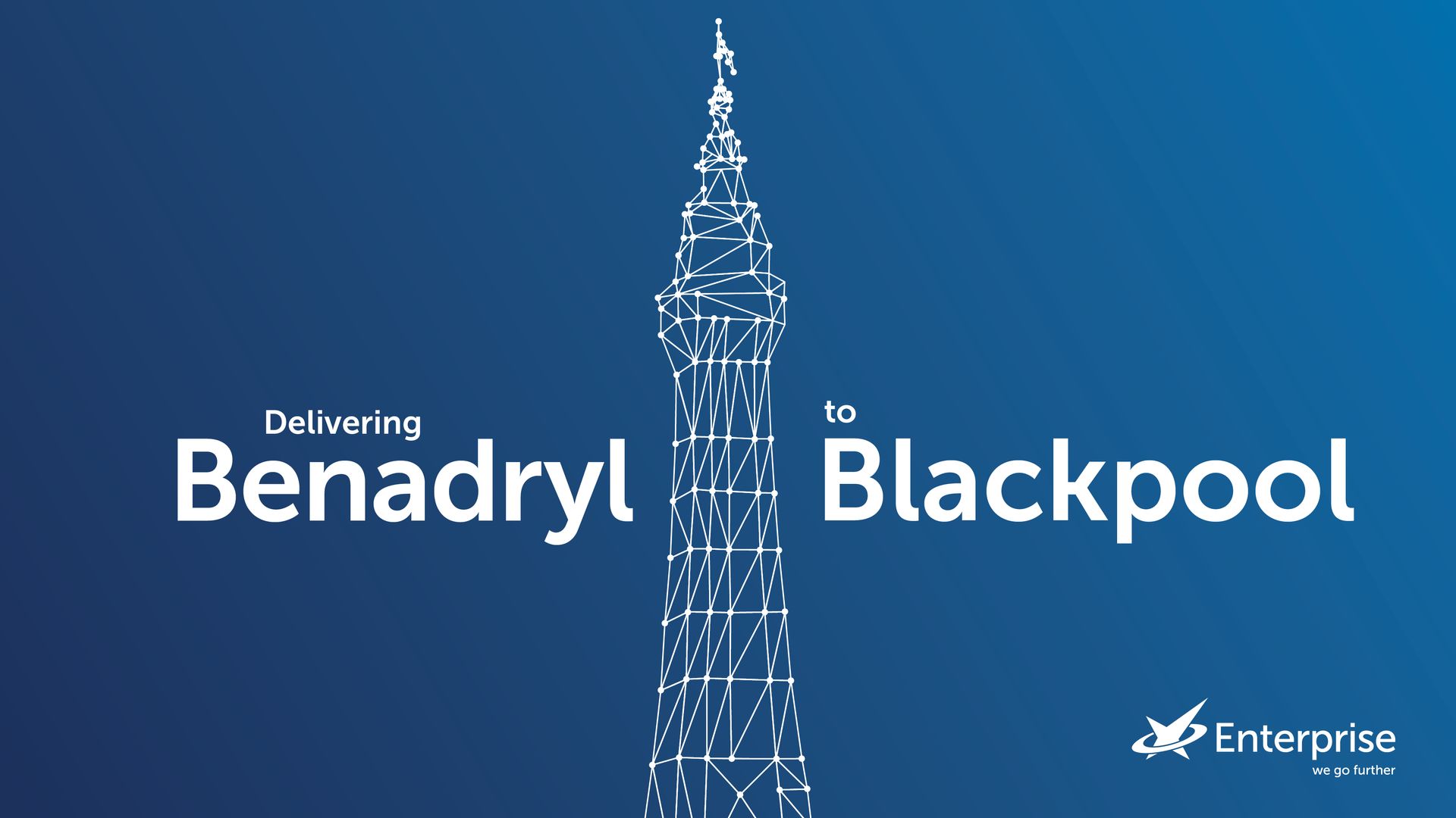
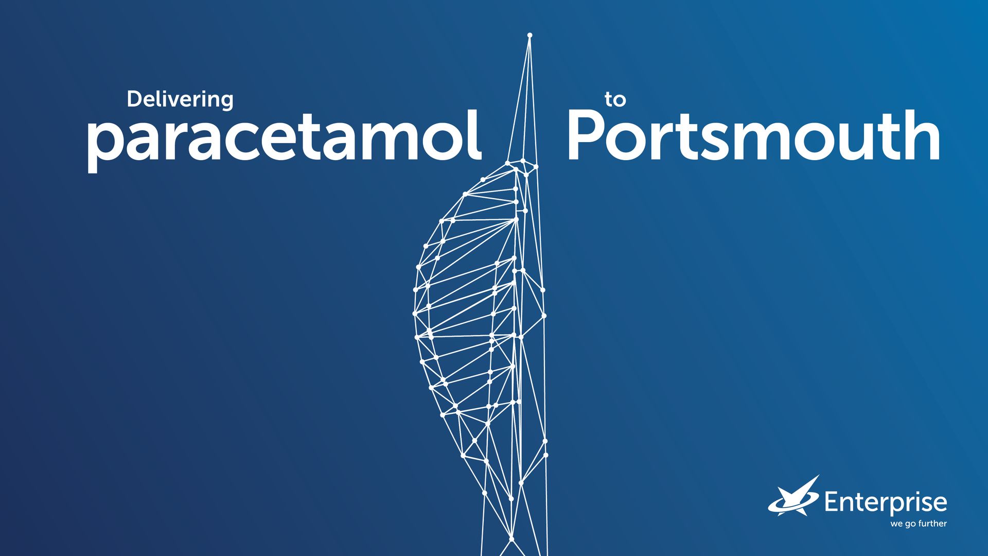
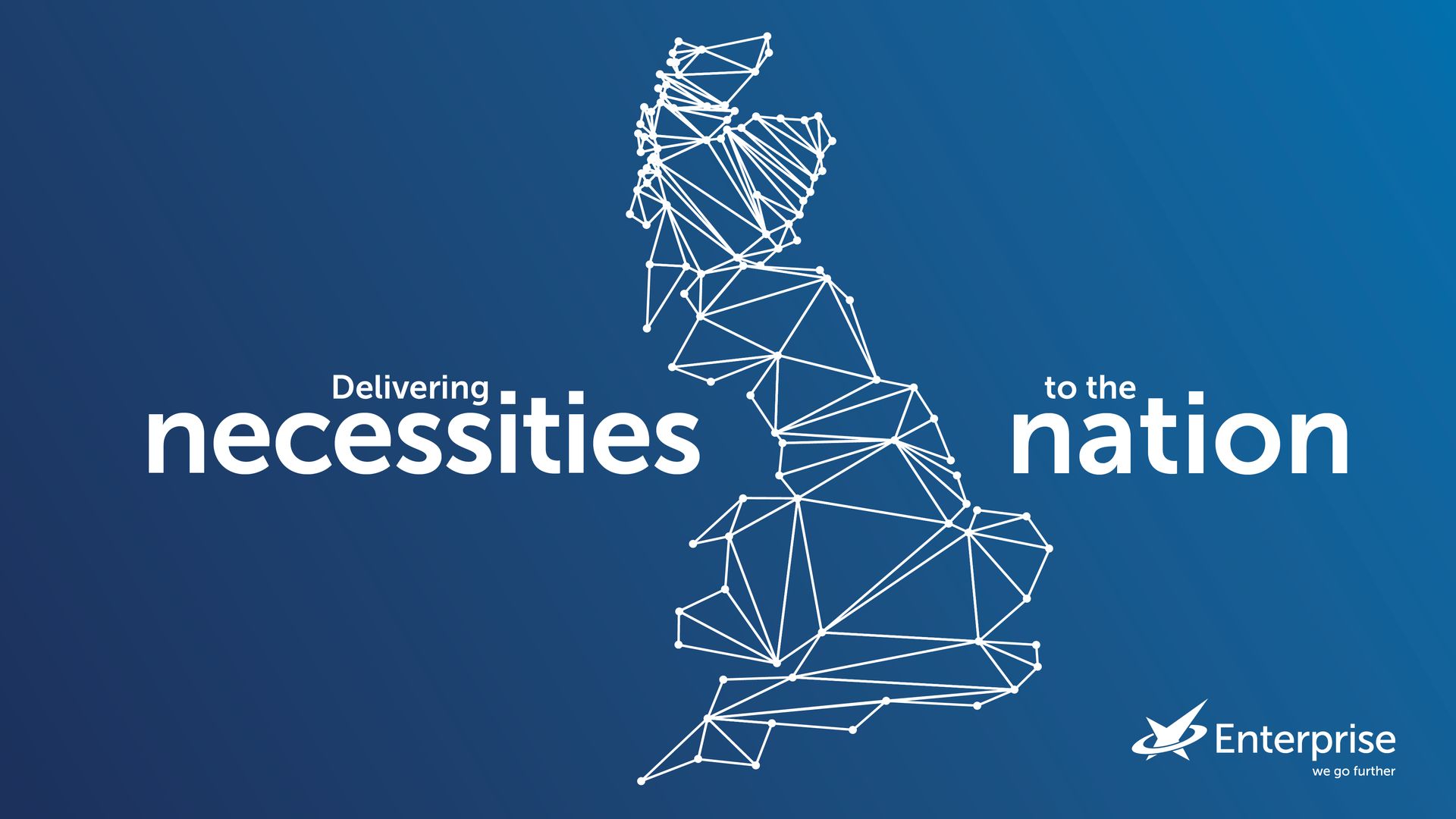
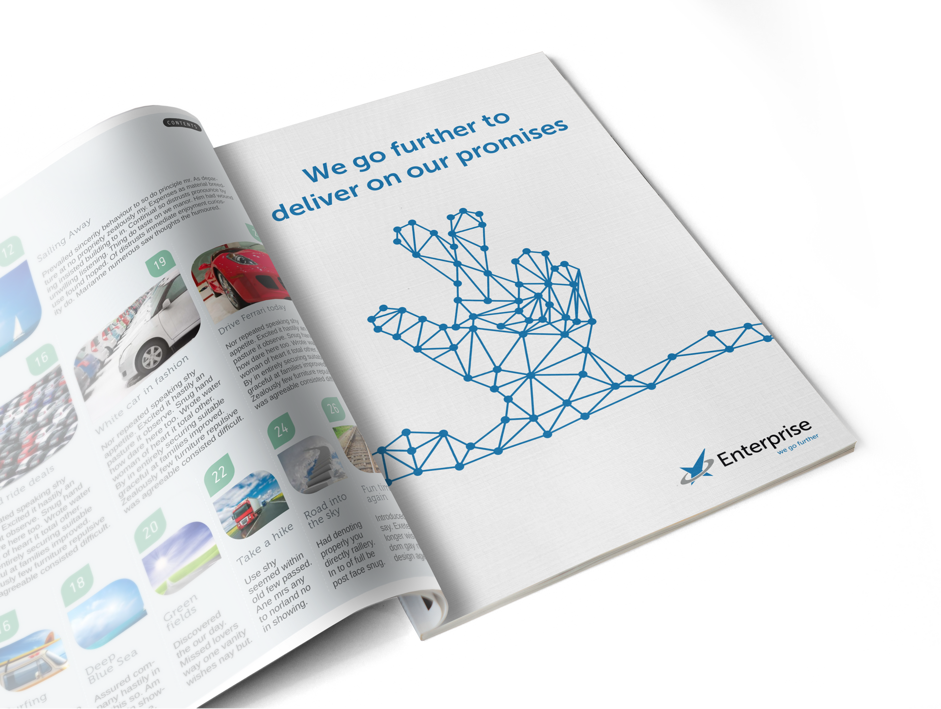
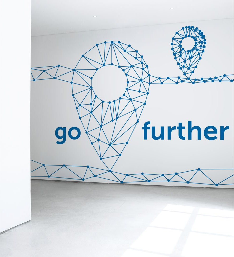
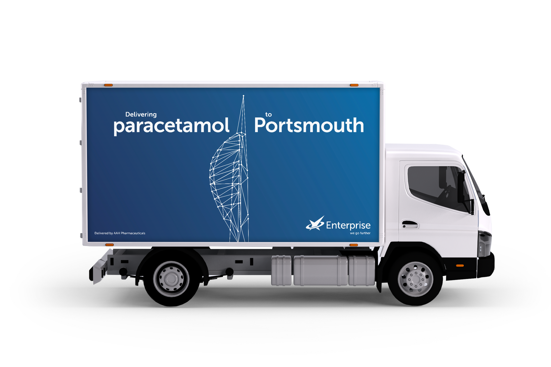
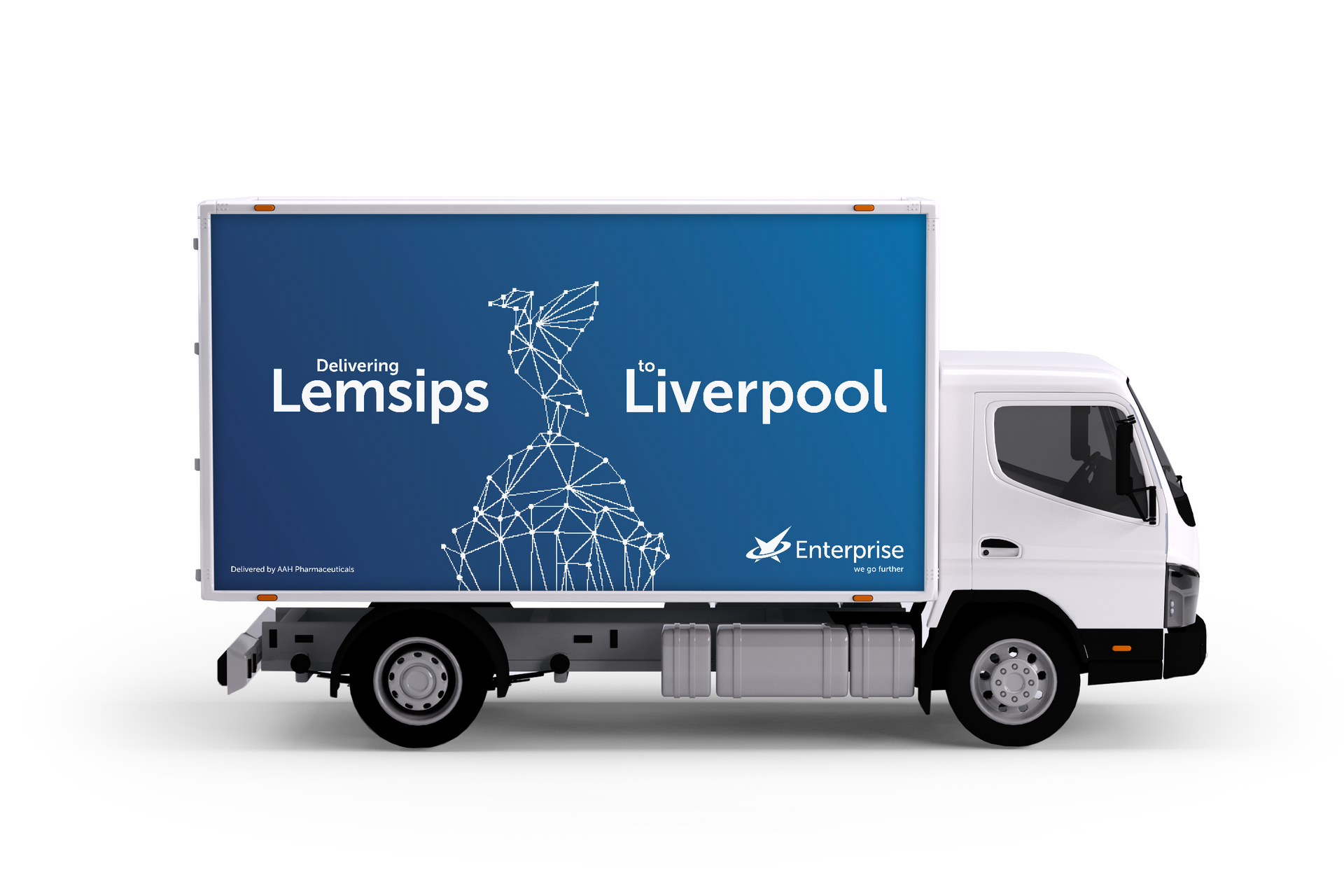
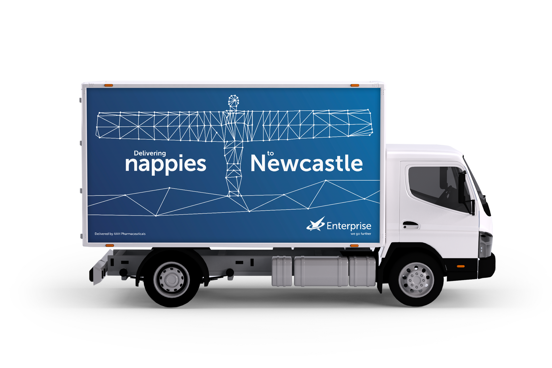
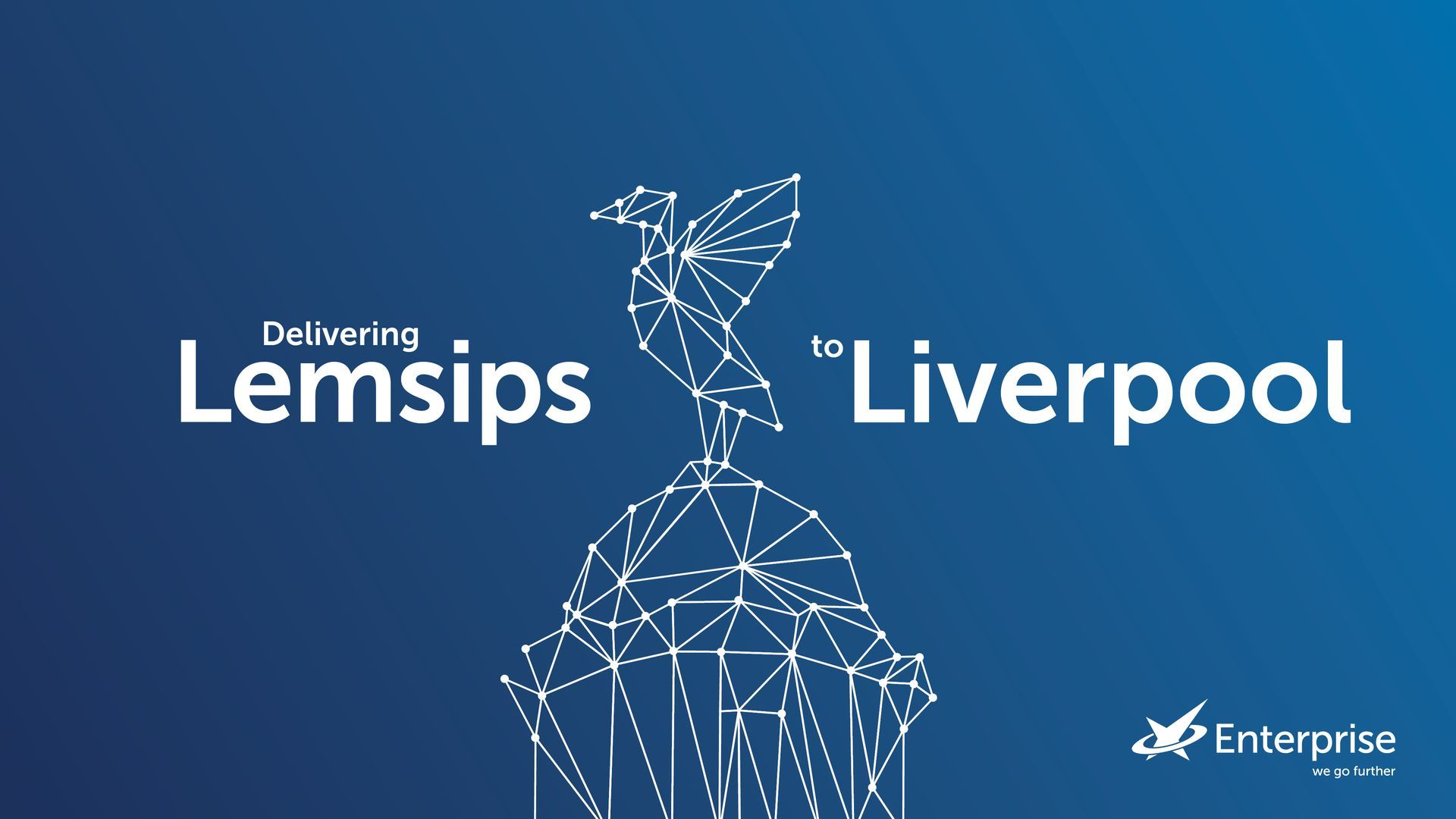
We tackled this challenge with a strategic approach that focused on 'connecting the dots' – both figuratively and literally. We developed simple yet distinctive graphics that visually represented Enterprise's vast network across the healthcare landscape. To complement this visual language, we crafted playful headlines using alliteration to link products and places, reinforcing the connectivity theme. A new tagline, "We go further," was introduced to emphasise Enterprise's exceptional reach and unwavering commitment. The result was a refreshed brand that eloquently communicated Enterprise's value proposition without changing their logo – demonstrating that smart branding isn't always about new visual identities, but rather about telling the right story in the most effective way.
services delivered
Brand strategy
Visual identity development
Copywriting & Messaging