BRAND ELEVATION FOR APA HEIGHT ACCESS

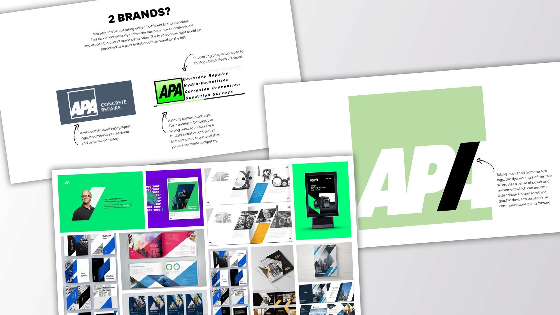
APA Height Access approached Thrive Branding for marketing materials, but we uncovered a deeper need: a unified brand identity. Faced with conflicting logos, we crafted a cohesive look without starting from scratch. With their logo already prominent on their fleet of vans and workwear, a complete redesign wasn't financially viable. Instead, we set about building a brand around their existing logo. Our solution? A dynamic shape inspired by the italicised 'A', symbolising elevation and growth.
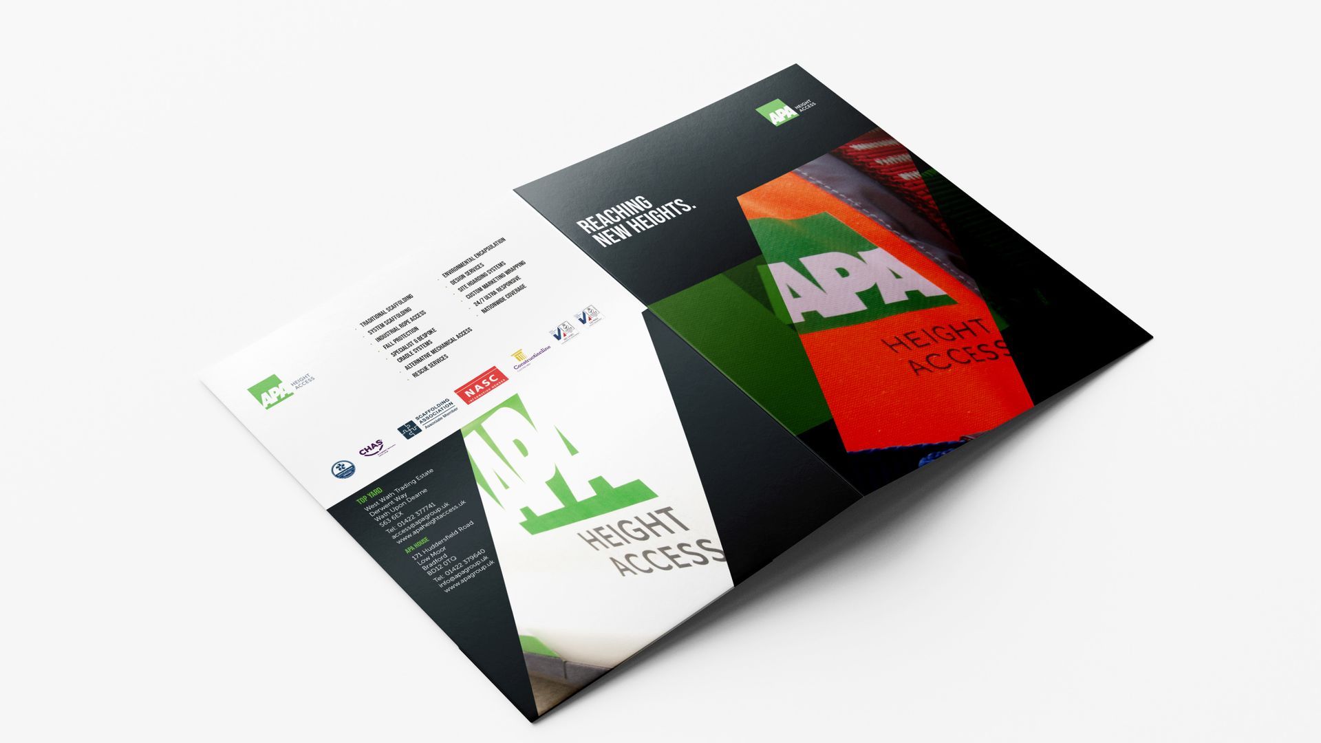
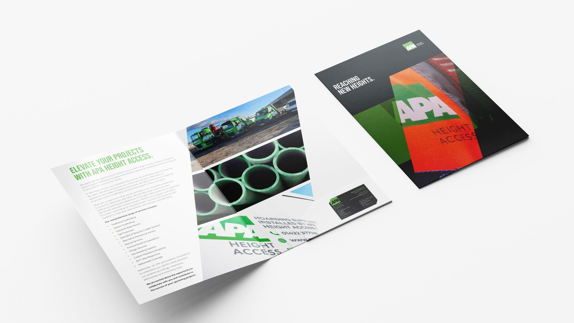
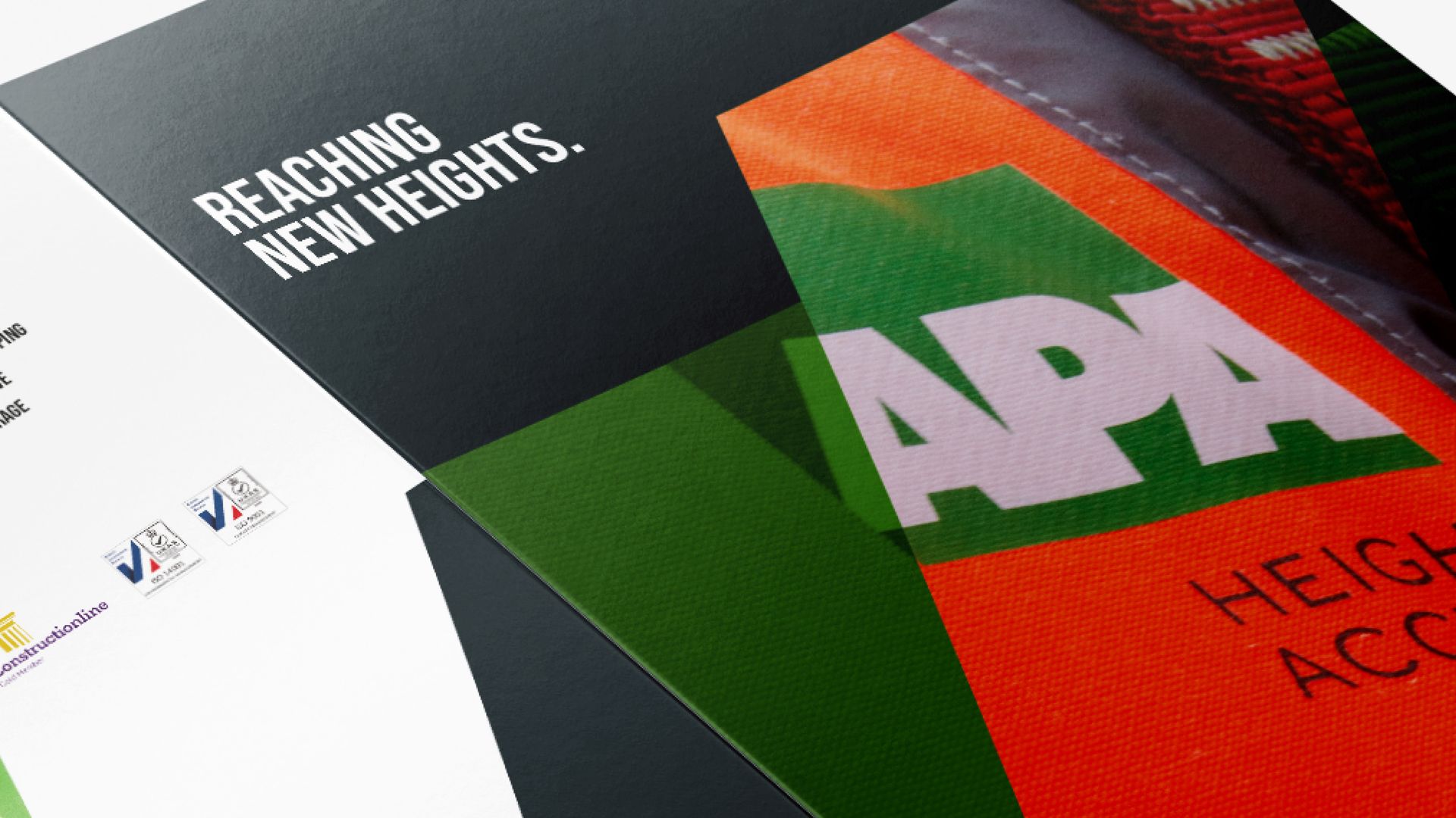
We designed high-quality folders with customisable case study inserts, enhancing APA's professional image for tenders. We conducted a comprehensive photoshoot featuring abstract scaffolding images, on-site team shots and professional management portraits. We developed a new website showcasing case studies, introducing the core team and detailing services and capabilities.
A cohesive brand identity that truly represents APA Height Access's professionalism and expertise.
services delivered
Brand identity
Marketing materials
Website
On-going marketing support
